Quality StreetProduct ContextQuality Street sweet tin made by Mackintosh.
Originally created in 1936, inspired by the name of a play by J.M Barrie. In the 1930s, only the wealthy could afford chocolate boxes but the creator Harold Mackintosh aimed to sell them at a more reasonable cost to appeal to working families. By the 1950s, when this campaign started, society was in a post-rationing period where luxuries were once again becoming an acceptable part of grocery shopping. Historical ContextThe icons of the Quality Street brand were two characters from the Regency era of British history.
In the Regency era, Britain went through a period of elegance with regard to Fine Art and Architecture. The Regency era could also be compared to the 1950s for its significant social and cultural development. Between 1811 and 1837 the country was under the rule of Prince Regent and developments in technology (e.g. the steam-powered printing press), fashion and architecture were mirrored by a population boom. These similarities can be compared to England in the 1950s. Social & Cultural ContextThe 1950s saw a change in “high culture”, a time where fine art, decadence and theatre that had previously only been accessed by the upper classes and those with money were now going to be made more affordable to the mass audience.
The Conservative Party’s 1951 election campaign was spearheaded by the slogan “Set the People Free”, and this supported drastic change as entertainment and arts became more accessible and affordable. Media LanguageStructure and design of the advert:
» anchorage of the gold frame – connotations of a halo effect around the man and the product » typical triangular geometric composition of the poster to help secondary anchorage of the product » product takes central framing. Typography is strong, forming the bottom third of the poster, and the strong purple colour stands out to draw the consumers’ eyes to the name. Hand-drawn, artistic nature of the design, with a rich colour palette of primary and secondary colours, links to the post-war consumerist culture. Persuasive language techniques such as alliteration, emotive language and superlatives are all indicative of a well-read educated audience; further enhanced by the bold, serif font styles connoting richness Connotations of the female characters being dressed similarly to the sweets that are shown close-up on the bottom third of the poster.
Inference of a dilemma can be investigated at two levels: » male ‘hero’ choosing between two ‘damsels in distress’ (Propp’s theory) » females choosing the chocolate . Costume and dress of male character indicating the formal nature of his dilemma; connotations of a higher class and richer society. Patriarchal narrative, which is part of a range of similar adverts of this time. Intertextuality The characters in the gold frame, Miss Sweetly and Major Quality, are part of the brand Identity of the product since 1936. The characters are symbolic of the Regency era of British history referenced by the dress codes of the characters in the gold framed picture at the back of the advert. The advert is part of a campaign from this time that uses a similar design. The brand identity of Major Quality and Miss Sweetly goes back to the origin of the product in the 1930s, so it is interesting to look at how their advertising has developed with these characters: RepresentationGender roles in the 1950s were remarkably different to the present day and it is important to consider the advertisement in this context. The product itself was designed and planned for working families and the imagery is very aspirational of a higher class which links to the postwar era in Britain.
The image suggests a male dominated society with regards to ‘choice’ – he is in control of the product and is centrally framed. This links to Mulvey’s male gaze in relation to the framing. The male character anchors the audience’s eyes to the product which has significant phallic symbolism. The dress code relates to the modern working businessman who may be the ‘provider’ of the brand. The women have two stereotypes being relied upon in the advert: firstly, that of their need for chocolate, a common and very traditional stereotype that still exists today, and secondly their subservient body language to the dominant man. The implication is that to be successful you will need to be romantically led by a man. There is also a secondary and deeper analysis here – a sense of manipulation with the women distracting the man through romance to access the ‘prize’ that is the product in the gentleman’s lap. This advert could be seen to be representative of the way in which society was moving at this time. The historical representations of the Regency characters show typical strong feminine colours, and the showing of flesh for Miss Sweetly, and the formal uniform dress of Major Quality signify importance and power in their own relationship. This advert is purposely for the young to middle aged adults (25–40), and the target audience could see themselves in the characters in the main section of the advert. 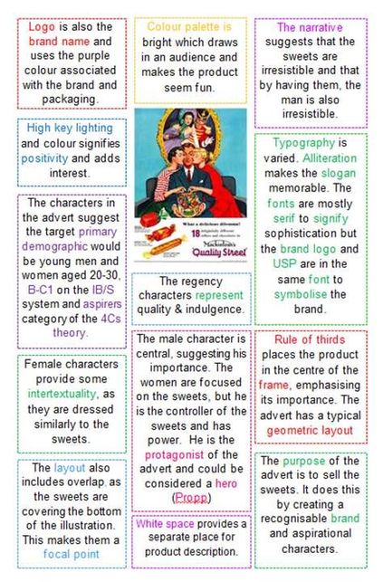
|
This Girl CanThis Girl Can Campaign ActivityProduct ContextThis Girl Can is a national campaign developed by Sport England and in conjunction with a wide range of partnership organisations.
The purpose of the campaign is to break down the primary barrier holding women back from participating in sport – the fear of judgement. The campaign seeks to target and celebrate ‘active women who are doing their thing, whatever that may be, no matter how well they do it, no matter how they look or even how red their face gets’. The campaign is currently funded by the National Lottery and backed by a government body, Sport England; there is no commercial aspect to it at all. Social and Cultural Contexts:Sport England carried out a lot of research to figure out why there was such a big gender gap in sports participation. They discovered that two million fewer 14-40 year old women than men partake in sport regularly and they wanted to understand why.
They discovered that: » 13 million women said they would like to participate more in sport and physical activity. » Just over 6 million of these are not currently active at all. » Fear of being judged was the number one barrier for most women who felt they were unable to participate in physical activity. As a result of the campaign, 1.6m women have started exercising and the number of women playing sport and being active is increasing faster than the number of men. Soon after the launch of the “This Girl Can” campaign, Nike released a more motivational campaign called “Better for it” which also portrayed a more ‘real’ side to fitness. Media LanguageA central, striking, image that encourages the reader to become intrigued to find out more about the advert:
» A medium shot of a woman in her thirties, exercising. Unlike many advertising campaigns, this female is not a celebrity. By purposefully avoiding using a sporting legend or an athletic goddess, the campaign is able to target ordinary women of all ages, encouraging them to take part in sport and showing them that they can achieve. » The lack of celebrity means that the woman in the advert feels familiar. The female in the image has her hair scraped up into a ponytail, she is sweating a lot and her clothes are not what society would consider fashionable. For all these reasons, there is a sense that you know someone like her or, in fact, you are her. (Personal Identity) The dominance of this image suggests she is the protagonist of this narrative, the ‘hero’ according to Vladimir Propp’s character theory. She is heroic because she is embracing sport; she doesn’t appear to care what anyone thinks and has shed any inhibitions. She is an inspiration to other women as it is obvious from her facial expression that she is really enjoying herself and is completely lost in the moment. Across the image is what the campaign itself calls a mantra, “Sweating like a pig, feeling like a fox.” The campaign has taken a derogatory comment, “sweating like a pig” and turned it into something more positive. » Historically it was considered un-ladylike to break into a sweat and, for many women, it is still the case. They don’t want to be seen sweating as it makes them red in the face, ruins their make-up and makes them feel unattractive. However, this mantra turns this on its head and perhaps suggests that by working out, you are becoming healthier and therefore will become more attractive, “like a fox” - a fox being a young, beautiful lady. Towards the bottom but still central is the name of the campaign, or brand logo, “This Girl Can”. This is a very positive statement with connotations of determination. It is used to reinforce the idea that all women should exercise and also to convince them that if they try they can succeed in sport. If you were unaware of this campaign, the limited text and unusual image would act like an enigma code (Roland Barthes) for the audience, as we want to find out who this character is and what the advert means by, “This Girl Can”. In the top left hand corner of the advert, there is the hashtag “#thisgirlcan” connecting readers to the campaign’s social media pages, should they wish to follow it or find out more, and there are logos for the producers of the campaign – Sport England and the Lottery. These are much smaller and tucked away so as not to detract from the visuals. Use of the hashtag will hopefully connect women with like-minded others and bring a sense of social cohesion. It also allows the print campaign to take readers to the complete YouTube advert, allowing them to understand the campaign and see more positive representations of women enjoying sport. RepresentationThe campaign’s agenda is to encourage women to participate in physical activities by challenging the dominant ideology. In order to do this, the campaign portrays women extremely positively.
Stereotypically, women have often been thought of as the weaker sex and often less successful, particularly where sport is concerned. However, this advertising campaign is seeking to challenge and subvert these stereotypes and convince women of their potential. The female in this image is portrayed from a positive viewpoint: she is represented as independent, confident and happy. There is a clear focus on her face, showing an expression of enjoyment and fun. By selecting such an image, the producers are seeking to challenge the sexism and male dominance in sport. The processes of selection and production have been carefully managed. (mediation) This advert, like the others in this campaign, has a certain ‘rawness’ to it, focusing on ‘real’ women. There is no glossy finish and it doesn’t resemble any of the high-end adverts produced by commercial sporting brands. » The females are supposed to be seen as heroic - aspirational role models for the readers. Audience members should see something of themselves in these women, bringing their own fear of judgement to the forefront and considering whether it is actually an appropriate fear to have when they see the amount of fun and enjoyment these women seem to be experiencing. In addition, the brand name, “This Girl Can” uses the noun “girl” as an all-encompassing term. It is used to represent (and target) the whole of the female population and make them feel included, a force to be reckoned with, a team, a united front. When used in the context of sport, “girl” can be thought of as having some negative connotations – “throw like a girl” is a common simile used to mock someone who cannot throw. It plays on the stereotype that girls can’t do sport. Perhaps then this statement is in response to that idea, “This Girl Can”. Interestingly though, considering that the campaign is targeting females of all ages, the word “girl” has been used rather than “woman”. “Girl” is usually associated with younger females and there is an argument to say that women over a certain age may feel disconnected from this campaign. 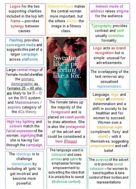
|