The film was created with an estimated $245 million budget making it the most expensive Bond film and one of the most expensive films ever made. It grossed over $880 million at the worldwide box office.
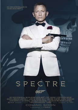
The poster was designed by Empire Designs, a British film promotion agency. The poster was released on 3 September 2015, as part of a wide global marketing campaign for the film. The masked man in the background is wearing a skeleton mask used to symbolise the Mexican festival of the ‘Day of the Dead’. The opening sequence to the film shows a ‘Day of the Dead’ parade in Mexico City, which isn’t something that actually took place in real life. However, the interest in the film, and the government’s determination to promote pre-Hispanic Mexican culture, meant that one year later the local authorities decided to organise such a parade (Dia de los Muertos) on October 29th 2016. It was a huge success and attended by 250,000 people. The Tom Ford white tuxedo worn by Daniel Craig revived a fashion trend from the 1970s. Previous Bonds have worn a white tuxedo, and John Travolta famously sported one in the film Saturday Night Fever in 1977. It has been argued that Daniel Craig initiated a fashion trend, as many celebrities including David Beckham and Benedict Cumberbatch were photographed wearing a white tuxedo around the time of the release of Spectre publicity, underlining the cultural significance of the Bond franchise. Media Language
The central image is a long shot of James Bond, smartly dressed, arms folded, with the gun pointing to his left.
The dominance of his image suggests he is the film’s protagonist and so probably a ‘good guy’. According to Vladimir Propp’s theory, he would be considered the ‘hero’. This is reinforced by the use of colour – Bond’s white jacket connotes his heroic status, contrasting with the dark, shadowed antagonist in the background. Bond’s clothing connotes business and professionalism and the gun, an iconic part of Bond’s ‘uniform’, is a common prop used in the action/thriller genre and so audiences can expect violence, action and danger. The gun is casually pointed, connoting that Bond is never off duty, he is always alert and ready for action. The tuxedo is iconic of the Bond image, and the white tuxedo connotes luxury, wealth and sophistication, the ‘high life’ that off-duty Bond enjoys (linked to martinis, women, gambling etc.). The red carnation has connotations of romance and passion, but also of danger. By placing Bond in such a strong yet casual pose, the audience is reminded just how cool, calm and collected Bond is. He is a trained assassin and working for MI6; he is relaxed here, but in control, and we are reminded of his ability to keep his composure in any situation. Bond is looking directly at the audience, seemingly making eye contact. This is a common convention of film posters and helps to add to the more personal approach of this format. The intensity of his stare and the lack of a smile could suggest how seriously he expects to be taken. A common convention for film posters is to have the actor’s name(s) placed quite prominently as another way to entice the audience. However, this poster doesn’t do that - his name is in a very small font in the upper left corner of the poster. This may be because the producers are confident that the audiences will all recognise him and any text may detract from the visuals. Craig’s name also appears alongside many other names ‘Albert R. Broccoli’s EON Productions presents Daniel Craig as Ian Fleming’s James Bond’, reflecting the many iconic figures involved in creating the franchise. At the bottom of the poster, the title of the film appears along with the iconic 007 logo. The gold font connotes luxury, wealth, aspiration and exclusivity; the capitalised title suggests power and strength. The title SPECTRE relates to the organisation that is in opposition to Bond in the narrative, but also connotes a ‘ghost’ from Bond’s past. Beneath this is another typical convention of film posters, the credit block. This gives industry information such as other star’s names, directors and producers, and is much smaller and tucked away so as not to divert the audience away from the main image or the rest of the poster. The white tuxedo intertextually references earlier Bond films (previous Bonds, including Roger Moore, have worn the white tuxedo, however this poster specifically references Sean Connery in Goldfinger), providing a sense of familiarity, nostalgia and pleasure to fans who recognise the link. Bond films have often deliberately referenced earlier films in the franchise, for example the ‘Bond girl’ emerging from the sea (Ursula Andress in Dr No and Halle Berry in Die Another Day). Daniel Craig also emerged from the sea in Casino Royale, his first outing as Bond, however it was denied that this was a reference to the earlier films. In the background, behind Bond, there is an image of a man wearing a skeleton mask and bone design on his jacket. The skeleton has connotations of death and danger and the mask is covering up someone’s identity, someone who wishes to remain hidden, someone lurking in the shadows. » It is quite easy to guess that this character would be Propp’s villain and his mask that is reminiscent of such holidays as Halloween or Day of the Dead means he is Bond’s antagonist and no doubt wants to kill him. » This acts as an enigma code for the audience (could reference Roland Barthes) as we want to find out who this character is and why he wants Bond. » The skeleton also references the title of the film, Spectre, connoting a ghostly, haunting presence from Bond’s past. RepresentationJames Bond is an action hero who, since the 1960s, has been constructed to embody many masculine stereotypes of strength, independence, sexual prowess etc. The representation of women in the franchise has traditionally been similarly stereotypical: the ‘Bond Girl’ who is the beautiful ‘love interest’ for Bond (Propp’s princess), insignificant to the narrative and ultimately disposable. The representation of gender in the Bond franchise has evolved over time - to an extent - to reflect the changing social context.
Craig’s Bond is not as sexist and overtly stereotypical as the earlier incarnations and reflects some contemporary notions of masculinity as his Bond is older, more thoughtful and shows signs of vulnerability. Interestingly, the poster does not reflect this development and represents Bond as the familiar action hero to ‘sell’ the film. Bond provides an image of masculinity that connotes bravery, intelligence and strength: » Bond’s posture is strong and dominant, his arms are folded in a stereotypically masculine stance. This closed body language connotes his lack of emotion, his independence, and also his professional role as a rational, ruthless assassin. » The use of the key light on Bond is stark and highlights his chiselled features, constructing a representation of tough, inscrutable masculinity. » The gun suggests danger but his posture connotes confidence with a relaxed attitude toward such dangers. » This ‘hero’ archetype is typical of the action genre and audiences are led to believe, through this representation, that this is how a man should be. The villain in the background is also male, reflecting the male-dominated nature of the franchise – the main protagonist and antagonist who drive the narrative are both male. The absence of female characters on this poster reflects a feminist perspective, as women are still under-represented within action film franchises. There are stronger female characters in Spectre, however this poster does not feature them and so we can infer that much of the marketing prioritises Bond as an iconic figure who will appeal to audiences. INDUSTRYCompany names: MGM, EON, Columbia, Sony can be researched in terms of production and distribution, ownership issues, including conglomerates.
Names of actors – exploration of previous roles, ‘star’ appeal. Director, writers, other crew e.g. DOP, Costume Designer – exploration of these roles and their importance in the production process. IMAX – role of technology in exhibition/ circulation of products. Hashtag, website – role of new technology and social media in marketing film products. Soundtrack on Decca Records – synergy and convergence of different platforms to promote the film. The James Bond series is produced by Eon productions, a British film production company based in London, Sony Pictures and MGM. The video rights of all of Eon’s films are owned by MGM Home Entertainment and are controlled by MGM’s distributor 20th Century Fox Home Entertainment. On April 9th 2010, a year and a half into the making of the 23rd Bond film (subsequently titled Skyfall), the producers decided to suspend production due to MGM spiralling towards bankruptcy. It wasn’t until the end of 2010 when the new owners of MGM were able to secure a $500 million revolving credit line that the film could continue. Luckily, it made $1.1 billion at the global box office, more than any other Bond film. This allowed the Bond franchise to continue. Bond has always been well known for its exotic locations across the globe and Spectre was no exception. Bouyed on by the success of Skyfall, Spectre used Pinewood studios in London as its base, but then was also shot in Mexico City, Rome, Solden, Morocco and Austria. Regulation : Film and video releases in Britain are amongst the most tightly regulated in the Western world. Age restrictions are placed on all commercially released films by the BBFC and some are even expected to make cuts or alter the film in some way to conform to the guidelines. Sony had to cut some violence from Spectre in order to secure a 12A UK rating instead of the 15 classification the BBFC originally recommended. This may seem like a sensible decision in order to secure a much wider audience, however, it could be argued that it is no longer the original movie that Sam Mendes, director, wanted the audience to see. The long-running Bond franchise has an established fan-base and Spectre, a US/UK co-production, received global distribution (theatrically and on DVD/ Blu-ray) to reach a very large audience. Unlike many media products, it is difficult to specify a specific target audience for Bond. The reason for this being that it has spanned so many decades, so many leads and so many directors. However, it is clearly intended for mass audiences and has great commercial appeal: » Bond is iconic and has universal appeal – he is charming, suave, good looking and, most importantly, always catches the ‘bad guys’. Arguably, men want to be him and women want to be with him, providing a form of escapism from their everyday lives. » Bond also provides a narrative we feel comfortable with (‘bad guy’ does something wrong, ‘good guy’ catches him and wins the day) and reinforces dominant messages and values about ‘good’ and ‘bad’. |
Based on a book of the same name, written by Ian Fleming, the film was produced by the British company Eon (Everything or Nothing) Productions and distributed by United Artists. The film was created with an estimated $7 million budget and grossed over $97 million at the world wide box office.
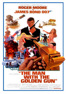
To reflect the popularity of the Martial Arts film genre, with the rise of stars such as Bruce Lee and Jackie Chan, there were several Kung Fu scenes and the film was filmed predominantly in Asia, having being shot in Hong Kong, Thailand and Macau. The artwork for poster itself was produced by artist and illustrator Robert McGinnis. Prior to the 1990s, illustrations were much more commonly used on film posters due to the limited technology that was available. The film was set in the middle of the 1973 energy crisis, when the oil producing Arab nations proclaimed an oil embargo causing an oil crisis which had both short and long-term effects across on politics and the economy across the globe. This is hinted at through the poster’s iconography of the power plant in the lower left corner and the energy beam directed at Bond. Media LanguageTypically, film posters are very visual and rely on images and limited text to promote the film. The images need to give the audience an idea of the film genre and hint at the narrative – here, rather than just one dominant image, there is so much going on that the reader is expected to work through the images to understand the film’s plot.
The central image is a mid-shot of James Bond, smartly dressed holding a gun across his body. The dominance of his image suggests he is the film’s protagonist and so probably a ‘good guy’. According to Vladimir Propp’s theory, he would be considered the ‘hero’. Bond’s attire connotes business and professionalism and the gun, an iconic part of Bond’s ‘uniform’, signifies danger and action. Bond is looking directly at the audience, seemingly making eye contact. The intensity of his stare and the lack of a smile could connote how seriously he expects to be taken and that he appears calm despite the chaos surrounding him. This informs the audience of one of his great strengths, his ability to keep his composure in any situation. A common convention for film posters is to have the actor’s name(s) placed prominently as another way to entice the audience. Roger Moore had become a household name after starring in the well-known TV series The Saint and playing Bond in the previous film, Live and Let Die, so his name is placed directly above Bond’s image to reinforce the link. Evidence of Star Power. The title of the film appears with the name of the author who wrote the books (on which the films are based) at the bottom of the poster. The credit block, detailing industry information such as other star’s names, directors and producers, is much smaller and tucked away so as not to divert the audience away from the main image or the rest of the poster. Narrative: At the bottom of the frame, in the foreground, is an extreme close up of a golden gun. It is pointed right at Bond and someone is loading it with a bullet engraved with his name so the reader can interpret this as an attempted assignation on the protagonist. » The colour of the gun connotes wealth and status and the fact we can only see the hand of the shooter creates intrigue and what Roland Barthes would term an enigma code for the audience, as we want to find out who is trying to kill Bond. » Also, continuing Propp’s character theory, we would consider this person to be the ‘villain’. Surrounding Bond are even more enemies and people trying to kill him. These images, combined with the images of destruction and explosions, are codes that signify to the audience this is from the action/thriller genre. As is typical of Bond films, the protagonist is flanked by females wearing very few clothes: » Two of these women are highly sexualised: bikini-clad, slim with perfect hour glass figure and long flowing hair. » Body language: one appears to be looking at the golden gun assassin whilst pointing at Bond whilst the other seems to be putting her arm out in front of him, seemingly protecting him. Barthes might argue that this is another enigma code, suggesting to the audience that Bond has female allies and enemies, yet all look the same making it hard for him to distinguish between them. RepresentationAt the start of the 20th century, many film depictions of minority ethnic groups supported the dominant stereotypes of the time: to be pitied, to be laughed at, the exotic and/or dangerous. While society was progressing towards racial equality by the 1970s, some of these stereotypes were still in evidence in mainstream films. In addition, it is interesting to consider this poster in the context of the move towards gender equality and increased women’s rights in the 1960s and 70s.
At this time, Bond was already iconic. He was the nation’s favourite secret agent; charming, suave, good looking and, most importantly, always caught the ‘bad guys’. This representation of masculinity told audiences that this was what a man had to be at the time – intelligent, strong and prepared to put yourself in dangerous situations. If you were all of those things, you would be successful, gain respect and women would want you. The assumption then is that men should also be heterosexual. Two of the three females on the poster are wearing bikinis which show off their slim bodies. Both are heavily made up and wear earrings and bracelets as accessories to the ‘outfit’. The two women also have long flowing hair. » A feminist theoretical perspective would argue that this sexualised representation of women suggests that they are little more than bodies to be looked at. Another female, however, is dressed in a karate uniform and is shown in a martial arts pose, and appears to subvert this stereotype. She too has flowing hair but this time it is much darker and her skin tone suggests she is from a different ethnic group to the other females. This goes some way to explaining why she seems not to support the dominant sexualised stereotype portrayed by the other females; she is seen as exotic, different, the ‘other’. Interestingly, one of the main themes in this Bond film was an actual world event – the 1973 global energy crisis. With the embargo on oil, countries were considering alternative power sources and this is portrayed through the iconography of the power plant and the related explosions. By including this theme, the producers are encouraging audiences to consider what might happen if oil really did run out and predict what the outcomes would be for society. The producers have encoded certain ideas into this text but it depends on the viewer’s own social and cultural context how this image is decoded: » For example, the depiction of a female doing martial arts could be seen to support the idea that she is dangerous and to be feared or could be seen as a progressive way of looking at females, those who are strong, confident and fearless. Feminist theoretical perspectives - Laura Mulvey (in her 1975 essay ‘Visual Pleasure and Narrative Cinema’) coined the term the ‘male gaze’ which discussed how the audience is put into the perspective of a heterosexual man. In this poster, the audience is forced to focus on the curves of the women’s bodies, putting them in the eyes of a male. » Mulvey goes on to argue then that this denies the women human identity and relegates them to the status of objects to be admired for physical appearance. This could be further argued as the producer of the artwork was a male, Robert McGinnis. FILM PRODUCTIONFilm production consists of five major stages: development, pre-production, production, post-production and distribution.
» Development – ideas are created, if necessary rights are bought, screenplay is written and financing is sought. » Pre-Production – Cast and film crew are found, locations chosen and sets are built. » Production – The film is shot » Post-production – The recorded film is edited. Crew work on the sound, images and visual effects » Distribution – Finished film is distributed. It is screened at the cinema and released for home viewing. Key Terms ActivityCodes & Conventions ActivityPoster Analysis Activity
|